Hawbuck Lean Dyneema Wallet
journey
My first wallet was some nondescript, off-brand, off-leather bifold with credit card slots. It was thick and beefy, and remained as such seemingly no matter how many small bills I would stuff inside of it. It suited me well while in high school, where cash was all I thought in, and I needed plastic no more than an ID and a transit card.
A few years later, I discovered the Mighty Wallet at design shop. It was covered in comic book panels and felt lightweight and organized. I had never heard of Tyvek, and loved the idea of it being durable and water resistant. $25 was achievable on my budget at the time and I decided to upgrade. Even the two-sectioned bill area felt like a luxury. Quickly, I couldn't imagine having a wallet of any other kind of material. I loved the simplicity and ease that it allowed me.
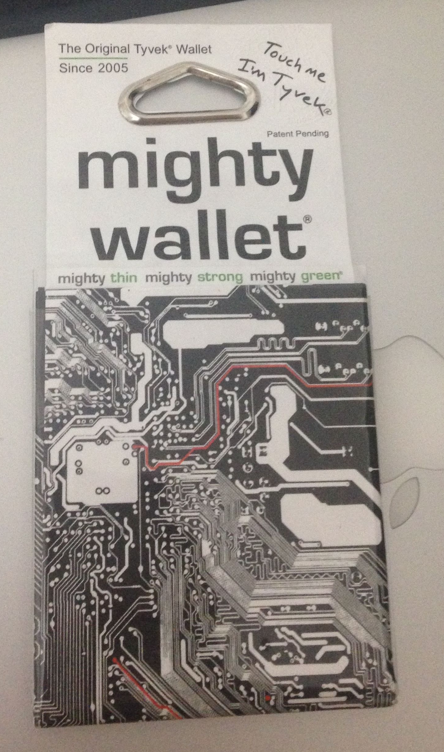 My last Mighty Wallet, brand new and untouched
Years passed and in university I found my wallet fraying at the edges, my now larger assortment of ID's and cards now poking out of the corners. I thought about moving on to something more "mature", more "refined", more "adult". I was even gifted a nice leather wallet one year that I spent some time with--but the bulk and heft of it never let me be comfortable with it.
I'll be honest, I'm a back-pocket wallet kind of person. This placement often gets written off as bad due to pickpockets and the potential for bad posture. The first problem is easily solved with a button, and the second is solved with a slimmer wallet.
I'm also a bifold wallet kind of person. While I admire the simplicities of smaller card-focused wallets, I still live in a cash-dominant community and find this form factor to be the best of both worlds.
Three more Mighty Wallets later, with my current one fraying, I went about searching yet again, and this time found something truly incredible. If I was excited about Tyvek, I'm even more blown away by Dyneema.
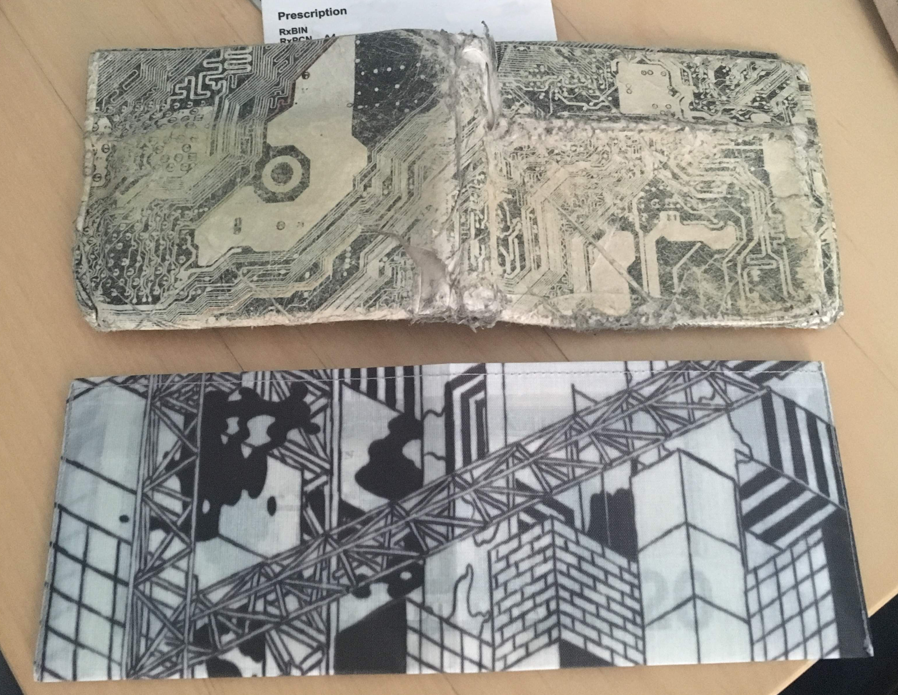 The Mighty Wallet on it's last legs, compared with the new Hawbuck Wallet
discovery
The Lean Wallet from Hawbuck is a simple bifold wallet, with two card slots on the inside faces, and a single bill pocket. A layout not too dissimilar from the mighty wallet or similar minimalist bifold wallets.
It's standout difference is in material. It is sewn from Dyneema Composite Fabric (DCF) material. The Composite in DCF describes that it's the joining of two materials--the Dyneema fibers themselves, and layer of Polyester fabric. DCF comes in a few different varieties, usually differentiated by their weight per square yard. Wes doesn't list the exact material weight on his site, but I believe it to be ~3oz / sqyd based on the 50 denier polyester face he mentions. Plenty of other makers who use this fabric have great in-depth explanations about this material and it's variations, such as HMG and Zpacks.
| numbers | |
|---|---|
| dimension | 2.8 x 7.75 in / 7.1 x 16.6 cm (unfolded) |
| weight | 5g / 0.18oz |
| cost | $30 - $40 (artist print) |
These wallets (and other items) are hand-sewn by Wes in Chicago. The care and attention he puts into them really shines though, and the overall quality is impeccable. In brief email exchanges, he's come across as extremely friendly and passionate about what he's been creating.
As for the form, Wes sews them into a few various shapes. This H01 wallet is sized perfectly for US currency, and thus perfect size efficiency with US bills. For larger sized notes, he's created other models.
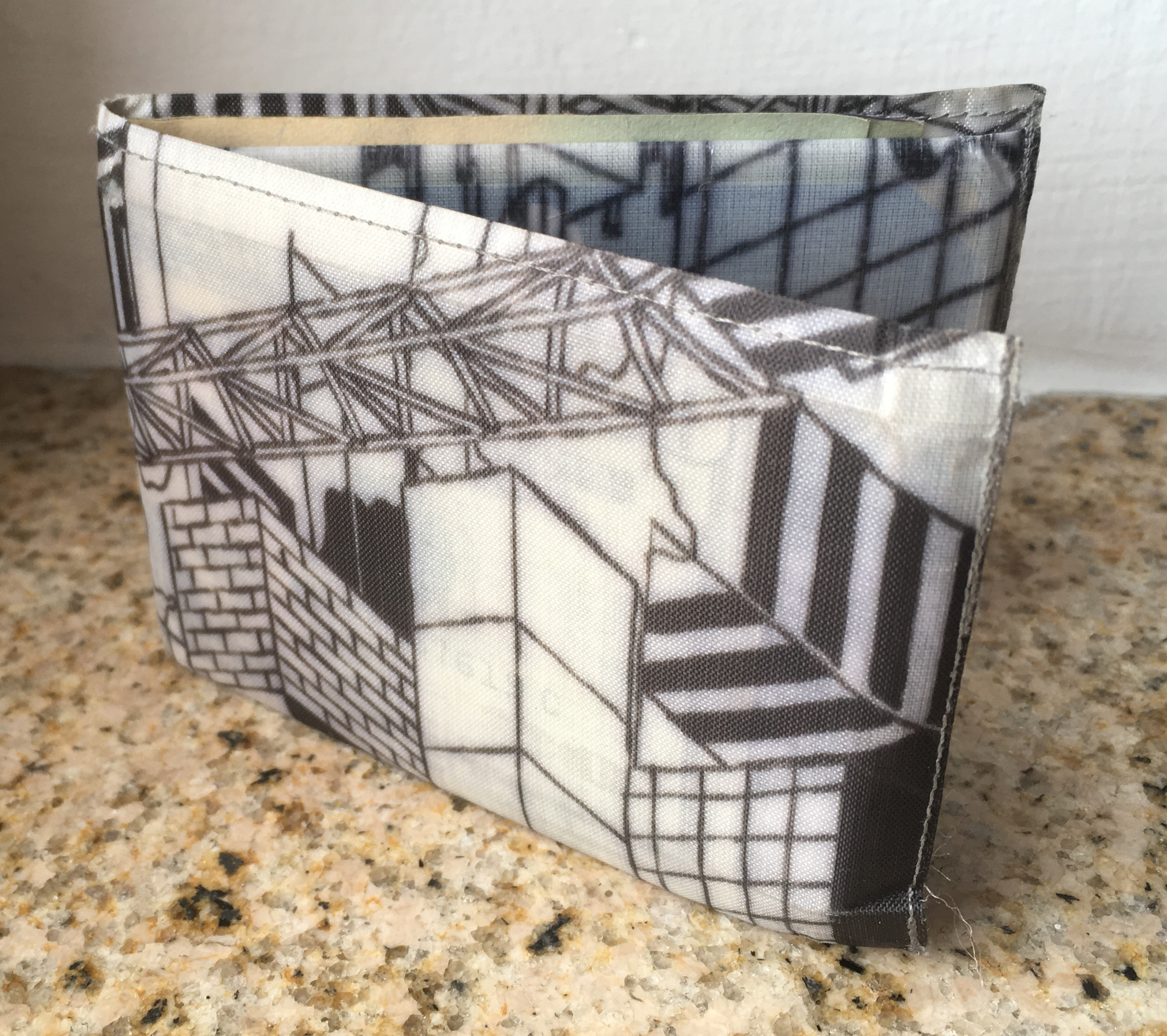
While most DCF products are usually grayscale or monotone, Wes has also partnered with some artists he has connects with to create some printed fabric that's really beautiful. The dye appears deep and rich of detail, and the patterns are really eye-catching. I've been particularly drawn to the prints by illustrator Andrew DeGraff. These have each been limited release funds with the additional cost going straight to the artists.
experience
I've had the Lean Wallet for about six months now, and it's been nothing but a joy to use. It truly is only the thickness and weight of your underlying items. It's encouraged me to really evaluate every card that I need on my person at all times, and delegate lesser used items to a backpack or other bag. It comfortably absorbs a dozen plus bills if needed, but really excels when carrying closer to a handful.
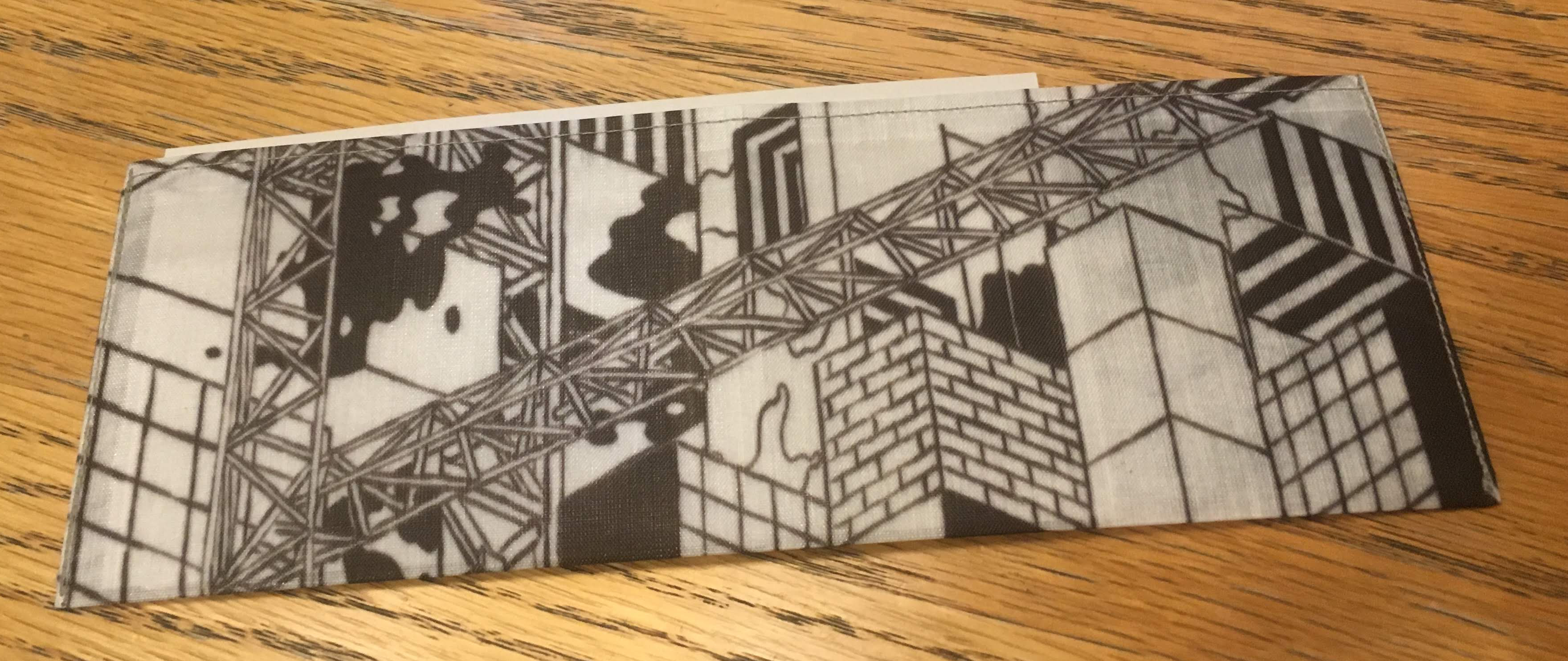 The outside face of the Hawbuck Lean wallet, fresh from the mail
The look is extremely modern and refined. It comes across as very form-forward and minimalist, reducing all unneeded aspects of a bifold wallet. I love the geometric print, organically drawn contrasting this futuristic material. The white / non-inked areas are slightly translucent as well, allowing imagery from the underlying bills to show through. I feel like this is a nice reminder of the cash inside and showcases that this is first and foremost, a vessel for carrying currency.
As I continue to adhere to my back-pocket usage, the only issue with this wallet has been the occasional fright that it's no longer there. It's near unnoticeable to sit on, run with, bike with, or to perform any other activity.
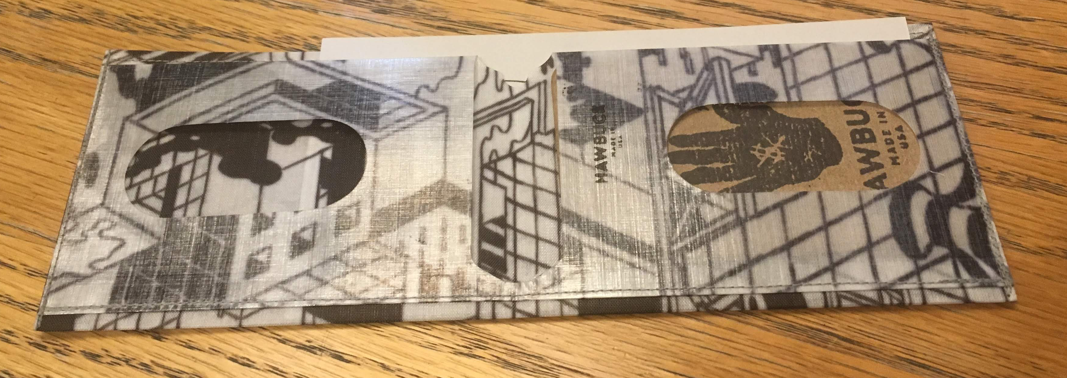 The inside of the wallet, showing the card slots and inverse card pocket construction
The method of pulling cards out is a little bit of an interesting design and worth discussing. Wes' design includes ovular cutaways over the card slots. These help quickly identify what card is on top, and allow cards to be slid out the main opening using one's thumb. It's an extremely quick way to get the top card out, but is a small bit of a process getting those deeper in the stack. One has to push the cascading new items out and then choose from the bunch that extrudes. Other products often have similar sliding / cascading approaches for removing cards and this cutout is a really clever way of achieving it. I definitely think it could have room for improvement in future iterations, but I'm very happy with how it handles. I do sometimes long for the ease of accessing the bottom card that my old Mighty Wallet gave me with it's angle-cropped entry.
Wear on it has been extremely light--the pattern shows zero fade, the stitching immovable, and no sign of warping or deforming. I've kept about the same number of cards and cash fairly consistently in it, and it's formed to that shape. The edges are bent from being sat on at the edge of my wallet, but that's not a bad thing. there's been some very light fraying on the outside edges, but it's easy to manage and mostly unnoticeable.
Some of the areas where I expected the most wear, such as the bottom inside fold where the card pockets meet, seem almost untouched, not having had their edges curled at all. The stamped logo on the inside face has worn a bit, but is still definitely recognizable.
The 50D outside face of the DCF has a matte texture which feels great to hold in the hand, and looks absorbs light nicely. It's also shown an incredible abrasive durability that's shown absolutely no nicks or scratches on it's surface. The inside card pockets appear to be constructed with the opposite arrangement, with the 50D facing inwards surrounding the cards. This clever construction means that repeated card insertion / removal is met with that same level of abrasive resistance as the outside, increasing the durability of the wallet.
conclusion
A pure reduction of form of the bifold has left me with a reduction in a need for anything else out of the form factor. I'm only left eyeing some of Hawbuck's other creations, such as the passport wallets or Wes' new tripocket.
I can't see myself ever using another wallet ever again, and with the durability of the DCF, paired with Wes' expert construction, I don't think I'll ever have to.